The Corner
Brand Identity
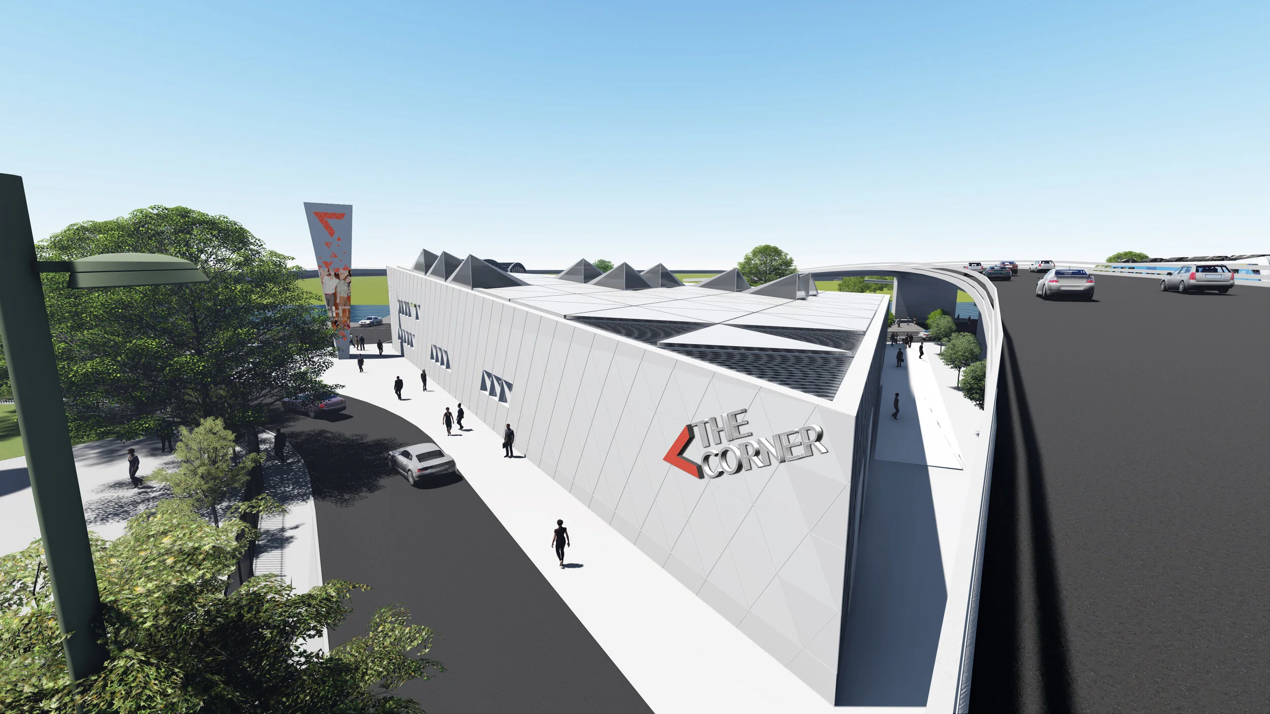
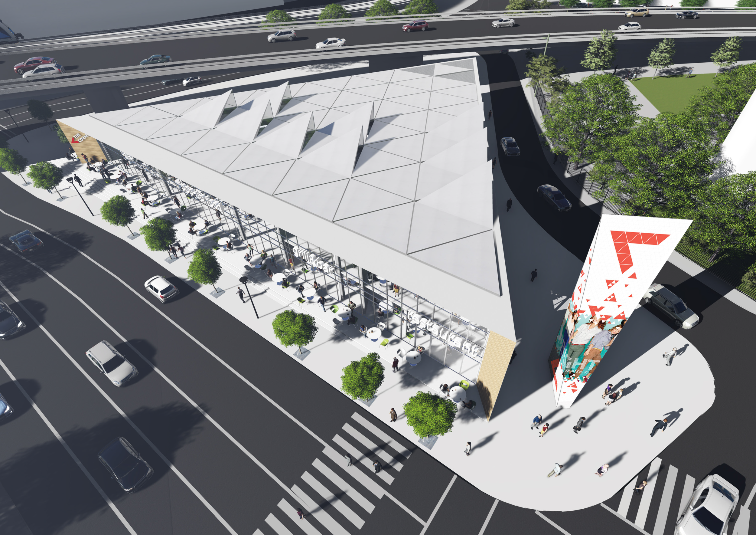
The Corner is a unique landmark building with a vibrant mix of gastronomy, media, culture and retail, that will inject new life into an important gateway site in East Village, Calgary, becoming another catalyst for regeneration in the area.
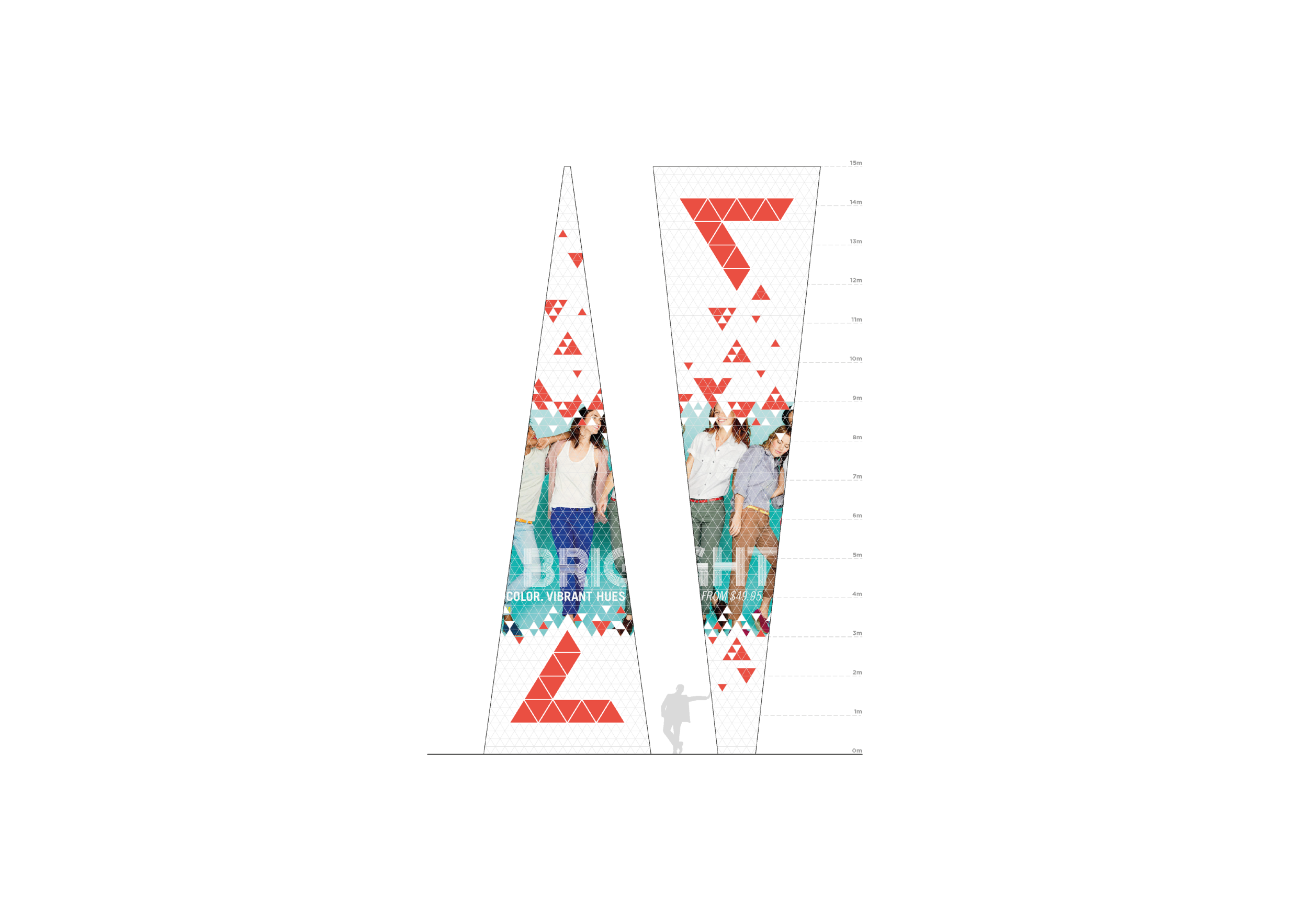
We were asked to establish a visual identity for the new corner of East Village. ‘The Corner’ identity lies in 3 key elements of the proposal: Architecture / Place / Name. We created a clear, simple identity to tie these elements together to ensure the brand can be communicated with a distinctive and unified look.
A dynamic corner stamp, inspired by the triangular building form, also visually references the name ‘The Corner’ and the letter ‘C’. The name its self is short and dynamic, acting as a statement. It represents the gravitas of the development’s location as a landmark site, a point of reference, and a gateway to East Village. Anchored by the logo mark, the lettering is positioned at an angle to animate the identity. The lettering appears to project from the logo mark symbolising a ‘shout out’, whilst the logo mark its self represents a mouth or a megaphone as if announcing one’s arrival to ‘The Corner’.
CAPABILITIES
Naming
Brand identity
Colour palette
Environmental design


